记得第一次使用 echarts 还是2019年的时候,那时做的一个物联网项目云平台的前端需要一些数据可视化功能,经过一些对比后就使用了 echarts 。上手非常快,专业性也足够,因此在后来其他的一些项目中就多次用到它。
echarts 是百度基于 JavaScript 实现的一个开源可视化图表库,主要特点就是可视化类型丰富、动画炫酷、使用简单。
这个教程就简单演示如何在 Vue 3 项目中使用 echarts。
一,创建 Vue3 项目并安装 echarts
npm 创建项目:
npm create useecharts
安装 echarts:
npm install echarts --save
二,创建数据可视化组件
通常可来说,我会把数据可视化功能放到单独的组件中来实现:单独获取数据,单独展示数据,只从父组件获取必要的控制字段。
(一)组件内容
创建一个组件 BarGraph:
src/components/BarGraph.vue:
<template>
<div class="echarts-box">
<div id="myEcharts" :style="{ width: this.width, height: this.height }"></div>
</div>
</template>
<script>
import * as echarts from "echarts";
import {onMounted, onUnmounted} from "vue";
export default {
name: "App",
props: ["width", "height"],
setup() {
let myEcharts = echarts;
onMounted(() => {
initChart();
});
onUnmounted(() => {
myEcharts.dispose;
});
function initChart() {
let chart = myEcharts.init(document.getElementById("myEcharts"), "purple-passion");
chart.setOption({
title: {
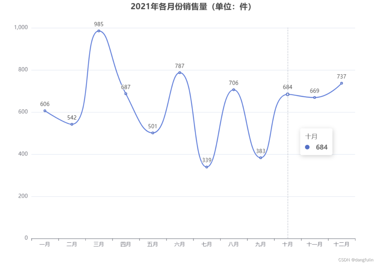
text: "2021年各月份销售量(单位:件)",
left: "center",
},
xAxis: {
type: "category",
data: [
"一月", "二月", "三月", "四月", "五月", "六月", "七月", "八月", "九月", "十月", "十一月", "十二月"
]
},
tooltip: {
trigger: "axis"
},
yAxis: {
type: "value"
},
series: [
{
data: [
606, 542, 985, 687, 501, 787, 339, 706, 383, 684, 669, 737
],
type: "line",
smooth: true,
itemStyle: {
normal: {
label: {
show: true,
position: "top",
formatter: "{c}"
}
}
}
}
]
});
window.onresize = function () {
chart.resize();
};
}
return {
initChart
};
}
};
</script>(二)使用组件
在父组件中使用上面那个子组件时,只需动态绑定控制数据窗口大小的控制值:
src/App.vue:
<template>
  <bar-graph :width="'900px'" :height="'600px'"></bar-graph>
</template>
<script>
import BarGraph from "@/components/BarGraph";
export default {
  name: "App",
  components: {
    BarGraph
  },
}
</script>
<style>
#app {
}
</style>
效果如下:
(三)程序解释
1,导入 echarts
import * as echarts from "echarts";
通常来说,在哪里实现就在哪里导入,而不是在 main.js 里面全局引入。
2,接收 props
通过 props 接收父组件传入的控制值,这种不写死的方式增加了数据展示大小的灵活性,
3,初始化 echarts
首先以调用 echarts.init() 的方式创建一个 echarts 实例。
这里我们指定了实例容器以及所用的主题。
然后调用 echartsInstance.setOption() 来设置图表实例的配置项以及数据,详见配置项手册。
1,通过 title 设置了图表的标题。
2,通过 xAxis 设置了直角坐标系中的 x 轴。
3,通过 yAxis 设置了直角坐标系中的 y 轴。
4,通过 tooltip 设置了提示框组件。
5,通过在 series 内部的 type 设置图例为柱状图,data 填充数据内容。
初始化工作是在组件的 setup 中完成的。
<template>
  <div class="echarts-box">
    <div id="myEcharts" :style="{ width: this.width, height: this.height }"></div>
  </div>
</template>
<script>
// 导入 ECharts
import * as echarts from "echarts";
import {onMounted, onUnmounted} from "vue";
export default {
  name: "App",
  props: ["width", "height"],
  setup() {
    let myEcharts = echarts;
    // 挂载时初始化图表
    onMounted(() => {
      initChart();
    });
    // 卸载时销毁图表
    onUnmounted(() => {
      // 销毁图表
      myEcharts.dispose;
    });
    function initChart() {
      // 基于准备好的dom,初始化echarts实例
      let chart = myEcharts.init(document.getElementById("myEcharts"), "purple-passion");
      chart.setOption({
        // 设置图表的标题
        title: {
          // 设置标题文本
          text: "2021年各月份销售量(单位:件)",
          // title 组件离容器左侧的距离
          left: "center",
        },
        // 设置图表的 X 轴
        xAxis: {
          // 数据类型为离散的类目数据
          type: "category",
          // 设置 X 轴数据
          data: [
            "一月", "二月", "三月", "四月", "五月", "六月", "七月", "八月", "九月", "十月", "十一月", "十二月"
          ]
        },
        // 设置提示框组件
        tooltip: {
          // 设置提示框的触发条件
          trigger: "axis"
        },
        // 设置图表的 Y 轴
        yAxis: {
          // 数据类型为连续的数值数据
          type: "value"
        },
        // 设置图表的图例
        series: [
          {
            // 图例中要展示的数据
            data: [
              606, 542, 985, 687, 501, 787, 339, 706, 383, 684, 669, 737
            ],
            // 设置图表的类型为折线图
            type: "line",
            // 平滑曲线
            smooth: true,
            // 在顶部显示数据
            itemStyle: {
              normal: {
                label: {
                  show: true,
                  position: "top",
                  formatter: "{c}"
                }
              }
            }
          }
        ]
      });
      // 大小自适应窗口大小变化
      window.onresize = function () {
        // 重置容器高宽
        chart.resize();
      };
    }
    return {
      initChart
    };
  }
};
</script>
三,响应式刷新
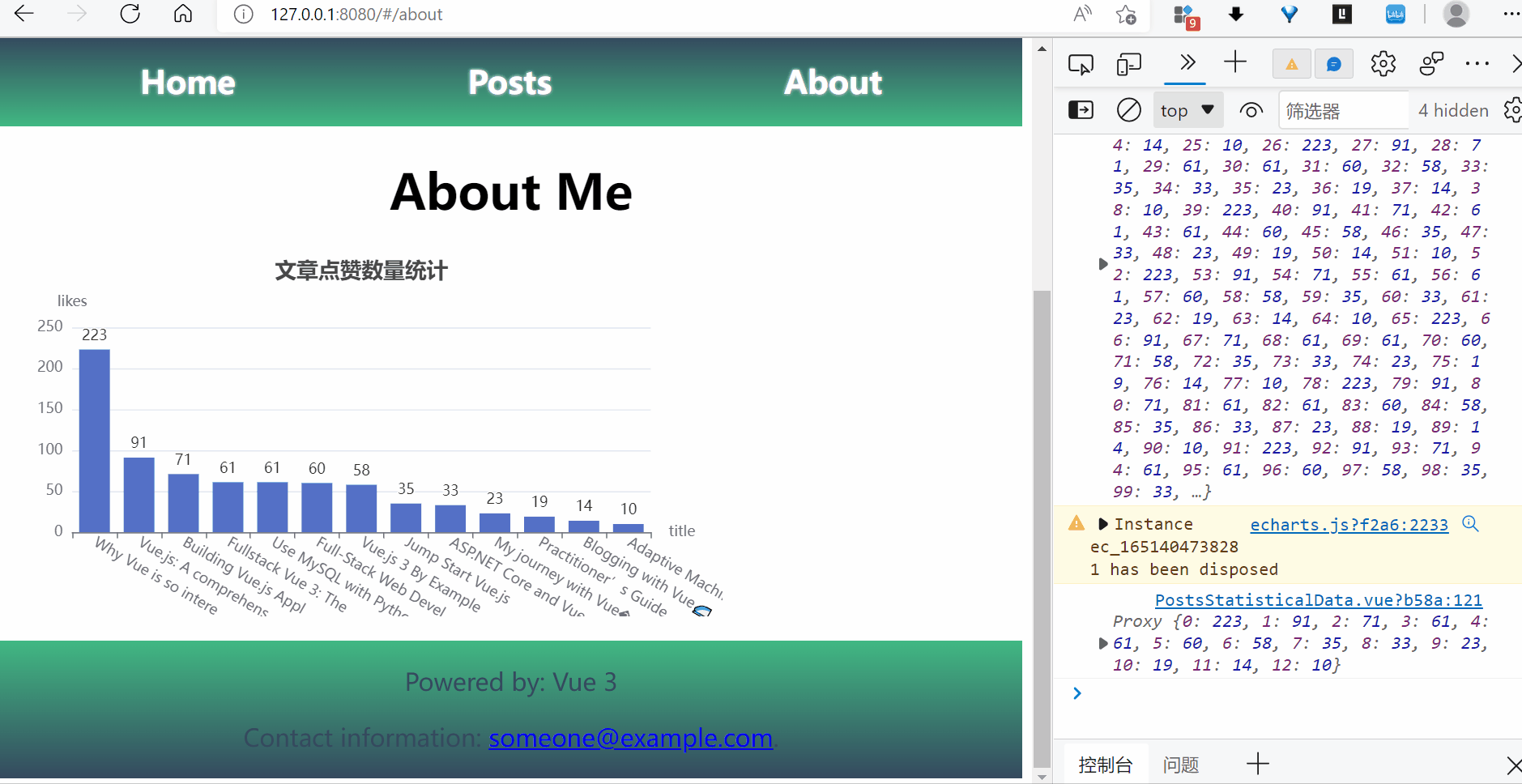
data property 中的数据本身就是响应式的,但有时其中数据发生变化时,图表并不跟随变化。
通常来说,data property 中要展示的数据都是从后台服务器中获取的,而这些数据通常是不断变化的,因此需要为图表添加一个响应式刷新的功能,
最简单的方式,就是使用 watch property 监听数据源变化,Echarts是数据驱动的,这意味着只要我们重新设置数据,图表就会重新渲染,
<script>
// 导入 ECharts
import * as echarts from "echarts";
export default {
  name: "App",
  props: ["width", "height"],
  data() {
    return {
      // 数据源一,从服务器获得
      postTitle: [...],
      // 数据源二,从服务器获得
      postLikes: [...],
      myEcharts: {},
      option: {
        // 设置图表的 X 轴
        xAxis: {
          // 数据类型为离散的类目数据
          type: "category",
          // 设置 X 轴数据
          data: this.postTitle,
        },
        // 设置图表的 Y 轴
        yAxis: {
          // 数据类型为连续的数值数据
          type: "value",
        },
        // 设置图表的图例
        series: [
          {
            // 图例中要展示的数据
            data: this.postLikes,
            // 设置图表的类型为柱状图
            type: "bar",
          }
        ]
      },
    }
  },
  ...
  watch: {
    // 如果 postTitle 发生变化,则重新渲染图表
    postTitle: {
      handler: function (newVal, oldVal) {
        if (newVal !== oldVal) {
          this.option.xAxis.data = this.postTitle;
          // 横坐标变化,纵坐标也相应变化
          this.option.series[0].data = this.postLikes;
          // 重新渲染图表
          this.myEcharts.setOption(this.option);
        }
      },
      deep: true
    },
    postLikes: {
      handler: function (newVal, oldVal) {
        if (newVal !== oldVal) {
          this.option.series[0].data = this.postLikes;
          this.myEcharts.setOption(this.option);
        }
      },
      deep: true
    }
  }
};
</script>
更进一步,对于有实时性要求的数据,比如物联网传感器数据,自然要实时动态刷新才行。
有两种方法:
- 前端定时向后端请求数据。
- 后端通过长连接定时向前端发送数据。
这里简单说说如何使用第一种方法。说来也简单,就是使用定时器周期性请求数据。
只不过有一个小坑坑(如果明白Echarts是数据驱动的,就不算):不正确地填充数据将导致数据堆叠,比如:
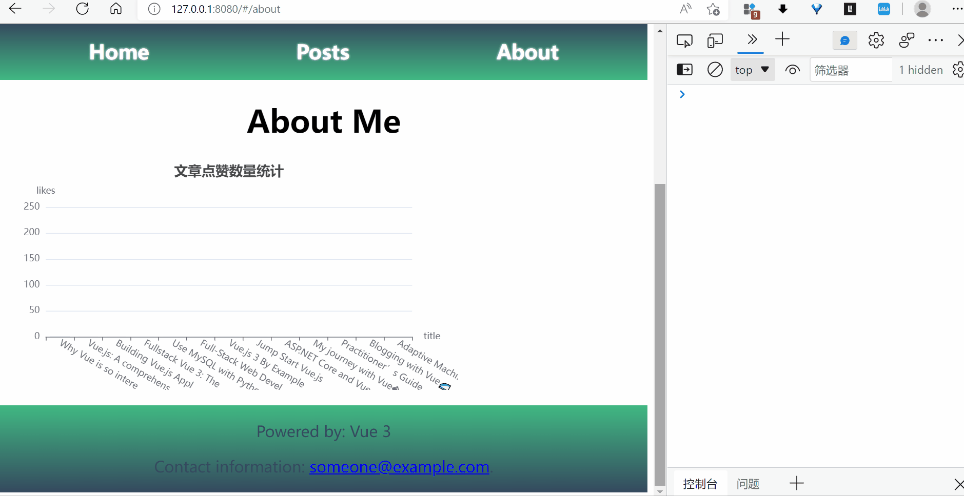
只需要在刷新数据之前清空数据源和图表中的 data 就行。
更多功能可扩展
1.多 X 轴轴切换:
2.数据区域缩放:
